 this was from the carters Mt trip and meh buddeh was walkin around outside an abandond house... i think i could have done a little better job printing, i feel like i shoulve burned around her a litttle more.
Tuesday, June 7, 2011
Portaits Critique
this was from the carters Mt trip and meh buddeh was walkin around outside an abandond house... i think i could have done a little better job printing, i feel like i shoulve burned around her a litttle more.Monday, June 6, 2011
The Photographers
 I really liked some of the photos David Doubilet shot. I liked the line of watter he uses to split two angles above and below the water, both of which alone would have been good shots. This photo uses rule of thirds heavily, the waterline, the sting ray, and the ship in the background. the lighting of the water, with the wavy sand lines, stingrays shadow. also, the rule of thirds was predominate.
 Pos/Neg critique
 while at carters Mt a friend and i were taking photos of eachother. i later decided to take this photo and use it for the posative/negative shots. i feel like its good, but i needed a more consitant form of printing the negatives and to have cut them better. the immage appears croocked
Framing
 I like the photo overall but I think I should have cleaned the negatives a bit more and added contrast. I was rushing a little and things didnt come together as well as I'd hoped.
Sunday, June 5, 2011

the over head lighting brings shadow to the eyes and definition to the bone structure.

in this one the side lighting pulls out definition in the face providing age or knowledge.

in this i see a fearful yet powerful man. like a caged animal almost.

this portrait brings a sympathetic feel.

the tattoo is showing a heritage of his own. an individualistic photo.

the happy little girl reminds me of a little girl playing at a park and posing really quick for her mom.

the intense side lighting puts forth a lot of emotion.

more dramatic side lighting.

the confused face of a cute newborn. intriguing and confused.

the portrait shows a man doing what hes got to do, his job, his dedication.
Dramatic lighting notes
Side lighting can be used
(windows, a low sun light)
Set the light meter when the face is lit (face takes up full view)
back away and snap photo from wanted position.
another way is to underexpose the shutter speed by 1 or 2 clicks (faster speed)
(windows, a low sun light)
Set the light meter when the face is lit (face takes up full view)
back away and snap photo from wanted position.
another way is to underexpose the shutter speed by 1 or 2 clicks (faster speed)
Portraits
To me a great portrait is s photo that can simply bring out an emotion with an expression. The photo has a certain feel to it, like you can imagine what the subjects feeling in the photo. Some of the most famous portraits have little in th background, maybe a painted wall or tiles. The subject also is often giving a subtle expression of happiness or even sadness. To me the combination of subtle expressions and limited background make a good portrait.
Tuesday, May 31, 2011
Framing critique
 I was walking through the woods near a old house and took one of the holes in the backroud to frame the bud of a flower. For me I wish the flower had just started to bloom but I wasnt there at the right time of year.
Framing in Photography
 The eyes are framed very closley and your attention goes right to them.
 In the side of the cliff the rocks closed around the photagrapher and it gave the landscape a framing look around the edge.
 The differant windows frame another part of the city behind.
 On the wedding day the bride and groom (Im assuming) were framed by the men on the sides with the umbrellas.
 The tunnel drives the viewers eyes right down the middle. The subject is also off to the side of the tunnel.
 Hands and Feet critique
 my hands and feet rool used more shots of hands, mostly because everyone around me wore shoes and that didnt seem to intrest me. instead i watched people do repedeteve tasks, such as typing, writing, or in this case, rewinding film. i had wished i had more of a old/young contrast to play with.
 Hands and Feet
 This photo grabs my intrest because it utalizes framing as well as hands and feet.
 In this one the subject looks like they're almost holding themselves, almost to comfort themselves. A familiar position of many people.
 The large, almost elderly hands are holding the baby in thier arms. Age supporting the new youth.
 Another one with a similar theme.
 overall a very common theme is the old holding the young. although its often repeated, its well known.
Rule of Thirds critique
 I like the photo, although I feel like I could have done a better job on it. with the contrast and lighting of the photo. Its just little things about it that I feel I could do better on.
Thursday, May 19, 2011
Rule of Thirds
 The small flower draws all your attention to it because of the dark, simple backround.
 The sun is places in the rule of thirds and the ship is along the horizon line, also the rule of thirds.
  the bird is standing in the nearly still water giving the image patience to it.
 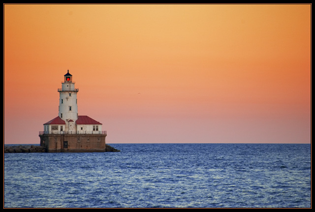 The lighthouse is far to the left giving the viewer a wide view of the ocean line and the orange glow of the sunset.
  The raod slowly drifts off to the right of the photo; the trees and fog give off and ere lookto it.
 Conveying a Message Critique

All an' all I think the picture was good but I with the film had been a little clearer so there wernt any lines across his face. I also feel like I should've burned the backround bit more to bring out details in the buildings and even the clouds. It wouldve made the mackround a lot less destracting.
Conveying a Message
This conveys the hunter redy to do what he has to.

This shows love and music together

The combitnation of the shadow and the balance and the dark side of justice.
I see confinement in this picture. The man is trapped behind the sheets.
This is almost a humbling photo. Seeing how the sun is prodominate 

Wednesday, March 30, 2011
From the DVD
1st) I really liked the photo of the feather on the rocks. it was just a matter of the simplicity and tranquility with the water in the background.
2nd) He did that project of taking ONE photo a day for 90 days to take what he had learned over the years and try and put them all together, instead of shoting many differant shots.
3rd) Some of his photography


2nd) He did that project of taking ONE photo a day for 90 days to take what he had learned over the years and try and put them all together, instead of shoting many differant shots.
3rd) Some of his photography


Lines (critique)
I think I could have gotten a little more creative with the lines assignment. The ones I took seemed rather bland and in printing they came out a little gray and bland. I would have added a little contrast to the bricks photo and with the fence one also.
Lines


critique (depth of feild)
On my depth of field pictures I think I did pretty well on, I was mainly in the woods so there were quite a few of "repeating" subjects; I lacked variety. but for the most part I think I had a well done picture of a very interesting log, and a wider view of the tops of the trees in a clearing. Again a lack of variety but it wasn't too bad.
Depth of Feild


The three above have very shallow depths of feild, focusing only on a very spacific aspect of the picture.


Subscribe to:
Comments (Atom)